I built the dinner planner I couldn't find.
No existing tool understood my family. So I built one that does.
Personal project, Stockholm, one weekend
The itch
Every meal planning app felt built for someone else.
Two kids, busy Stockholm evenings, specific dietary needs nobody's willing to compromise on. And I don't eat chicken. Every app I tried gave me the same 20 meals on rotation, generic, completely indifferent to my family's actual life.
Before
Built for everyone. Useful to no one.
Taco Tuesday again. No memory of last week. No awareness of time constraints. Suggestions for ingredients I'd never buy.
After
Built for us. Used every week.
Remembers 8 weeks of meals. Knows Tuesday means 25 minutes max. Generates a shopping list sorted by aisle. Cooks alongside you, step by step.
What it does
Built around real constraints, not imaginary users.
Middag knows things other apps don't ask. It knows Tuesday means dinner on the table in under 30 minutes. It knows you ate pasta last Thursday, so it won't suggest it again for eight weeks. It knows Saturday is different, so it gives you something worth the effort.
You tap one button, and a week of authentic dinners, planned around your actual schedule, appears in seconds. The shopping list only includes the days you're cooking. Pantry staples you've already catalogued disappear automatically. Change the serving number and every quantity across every meal adjusts instantly.
Rate any meal and the app learns. Within a few weeks, dishes the kids ignored quietly disappear from future suggestions. Save the ones that land, and they become the backbone of your rotation.
A product tour
Four screens that tell the full story. The real thing is further down.
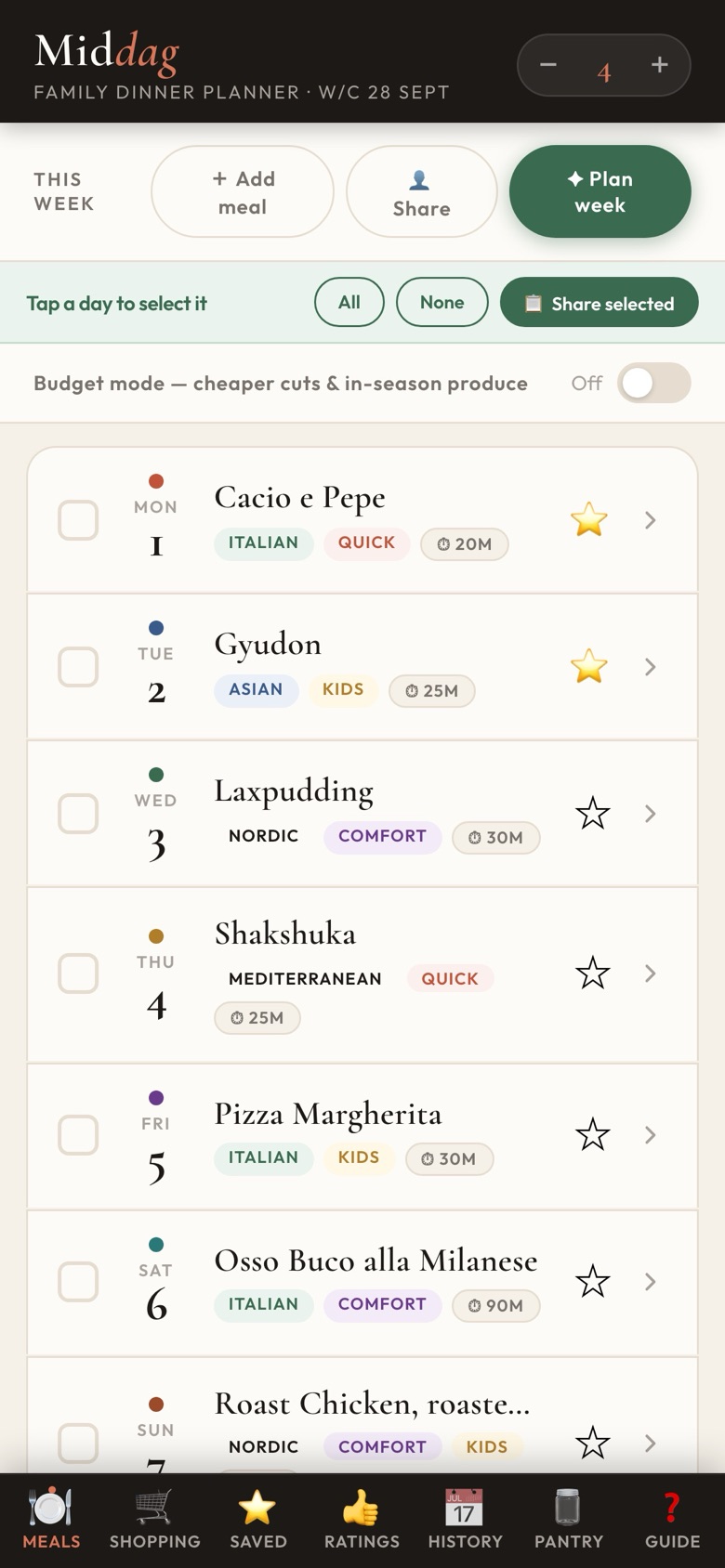
A full week, planned in seconds
Quick meals Monday to Thursday. Something worth the effort at the weekend.
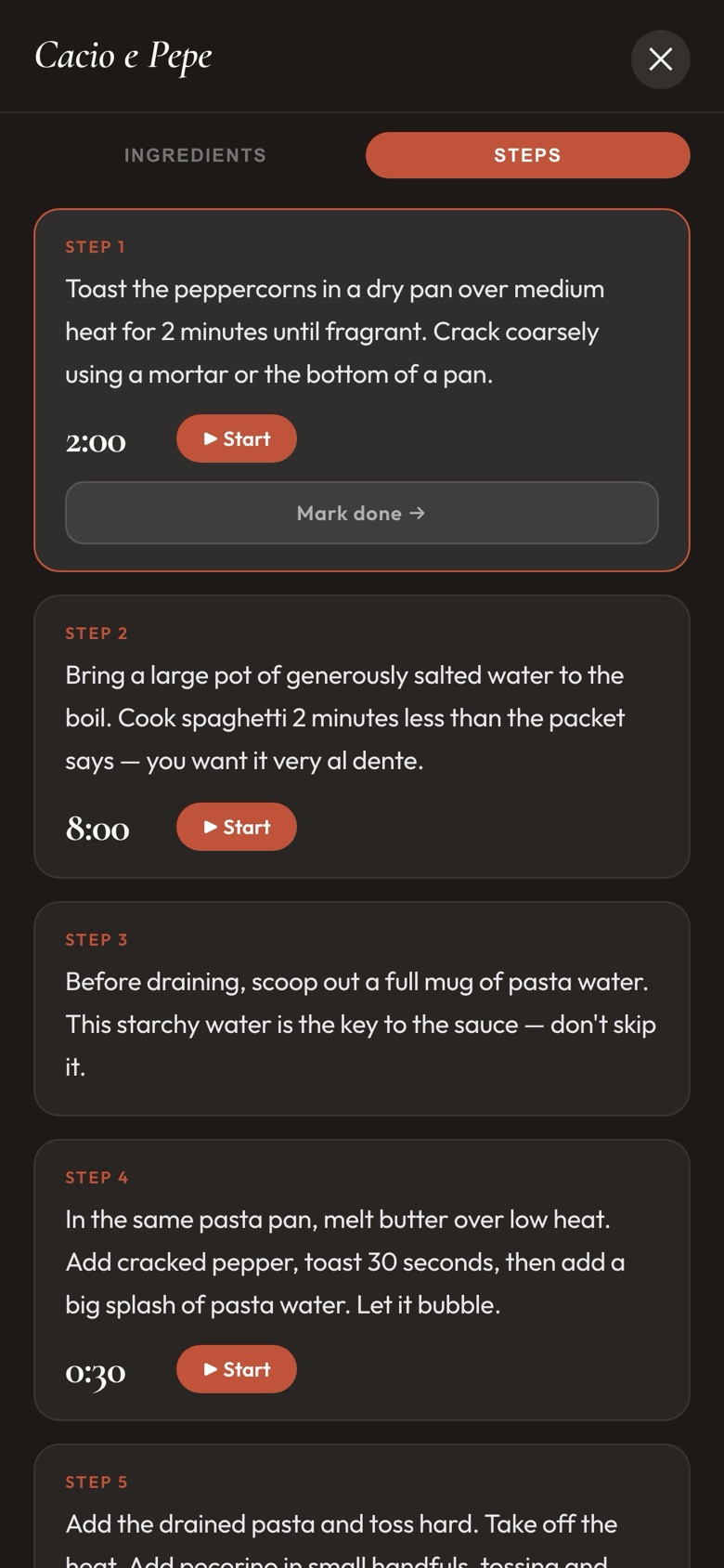
Cook mode with live timers
Step-by-step instructions, timers built in. The screen stays on.
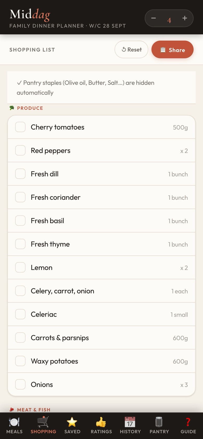
Sorted by aisle, not recipe
Only the days you're cooking. Pantry staples you've catalogued disappear.
Portions scale everything
Change the number in the header. Every quantity across every meal adjusts instantly.
What makes it different
- Schedule-aware
- Monday is fast. Saturday is not. The AI knows your week before you do.
- Cook what you choose
- Uncheck Tuesday and it vanishes from the shopping list. Only your days, nothing more.
- Pantry lives in the background
- Mark olive oil as a staple once. It disappears from every list, for good.
- One number, every quantity
- Change portions from 4 to 6. Every ingredient in every meal adjusts instantly.
- Gets smarter every week
- Rate a meal. Skip a dish the kids ignored. Middag adjusts and stops suggesting what nobody eats.
- Save what works
- Bookmark any meal into your saved library. Your favourites are always one tap away.
- Share the whole plan
- Send the shopping list or the full weekly menu to your partner in one tap. WhatsApp, Notes, wherever.
Design thinking
The detail nobody asked for is the detail that matters most.
Most products are designed to be functional. A few are designed to feel good. Almost none are designed to know you, to anticipate what you'd notice if something wasn't there, and make sure it is. That third layer is where Middag lives. Not because I designed for it. Because I was the user, and I couldn't design around it.
Layer 1
Functional delight
It works, reliably. The plan generates. The shopping list appears. The timers run. Most products live here and call it done.
Layer 2
Emotional delight
It feels considered. The palette, the typography and the micro-interactions make the mundane task of dinner planning feel like it was made for someone who cares.
Layer 3
Deep delight
It anticipates you. It knows what you'd notice if it wasn't there.
Middag lives here
“When my family has chicken, Middag offers me something else. Without making it a whole thing.”
Stack in a weekend
One person. One weekend. Deployed on Sunday.
Not a showcase of the stack. Just evidence that knowing how to build changes how you think as a PM.
Built with
React PWA (works offline), Claude API (meal generation), Vite and Express (full-stack), One weekend (Friday to Sunday).
Try it
The actual app. Tap around.
This is the real UI, not a prototype and not a simulation. Plan a week, open cook mode, explore the shopping list.
- 1
Plan your week
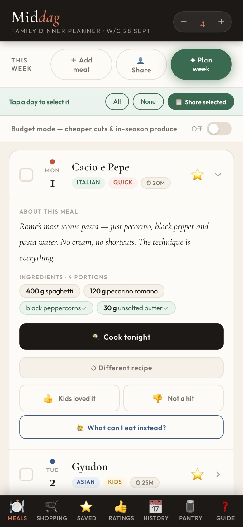
Hit the green button. A week of dinners appears in seconds. Tap any day to expand the recipe.
- 2
Open cook mode
Expand a meal, then tap Start cooking. Full-screen step-by-step with built-in timers.
- 3
Check the shopping list
Tap Shopping in the bottom nav. Every ingredient sorted by aisle, pantry staples already filtered.
- 4
Adjust portions
Use the number in the top-right header to scale everything for your household.
What building for yourself teaches you
When you're the user, you can't talk yourself out of the rough edges.Every shortcut you take, you feel at 6pm on a Tuesday.
Building Middag made me a sharper PM, not because of the stack, but because I had nowhere to hide. Good products have a rhythm to them. Intentional, not frantic. That's only visible when you're the one living inside them.
Stefania Tardito, Product Rhythm, Stockholm
Back to work